


When a Single Tap Breaks Trust
What a dark pattern on ShopeeFood taught us about product design, heuristics, and trust debt.

At Screate, we often talk about finding product-market fit through user activation, community, and honest growth loops.
But what happens when the product design itself tricks the user?
Please note that this isn’t a teardown of ShopeeFood just to dunk on bad UX. It’s a case study in:
How friction hidden behind familiarity can hurt long-term trust
How behavioral design without clarity drives support tickets, not loyalty
And why trust debt is growth debt, especially when you're scaling
Here’s what happened when one hungry tap cost more than dinner—it cost trust.
Earlier this week, I opened ShopeeFood to order dinner. I was hungry, tired, and looking for something fast and affordable.
Right there, in the middle of the app, a bright banner screamed: “Trùm Deal Ngon” — with up to 50% off on combos.
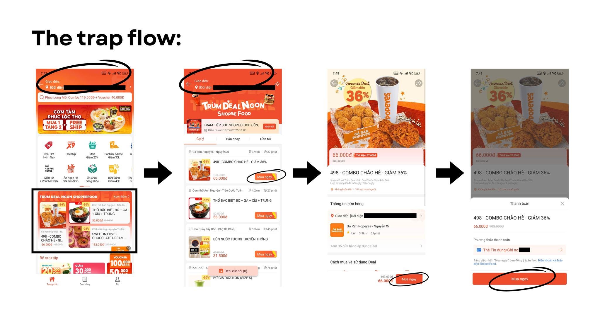
Nice! I clicked in, saw a Popeyes combo with a big juicy food image, my address already filled in, and a “Buy Now” button, all the signals of a normal food order.
So I did what most people would do in that state: I clicked buy.
All signs pointed to “food incoming.”
Except… it wasn’t.
The Gotcha Moment
What I actually bought was a voucher. Not food. Not dinner. A digital voucher with the fine print buried far below the fold.
Here’s what followed:
I had to make another order to redeem it.
I paid full shipping.
The merchant canceled twice because it was late.
And the voucher? Non-refundable.
One tap. One assumption. Gone was the trust I had in the product.
Why This UX Fails
From a user psychology lens, I was in System 1 mode — fast, automatic thinking. Hungry, distracted, and acting on habit. Not scrutinizing fine print.
But the app exploited that. Here’s how:
UI mirrored a normal food checkout flow.
Address auto-filled.
CTA said “Buy Now”, not “Buy Voucher.”
Food image dominated the screen.
No warning. Just a buried note under the image.
Each of these elements primed me to believe this was a standard food order.
That’s not a bug. That’s a dark pattern.
What This Reveals About Product Design
At Screate, we encourage early-stage teams to design for clarity, not just conversion. This ShopeeFood flow is a clear example of:
Mistaking familiar UI for user understanding.
Driving engagement at the cost of trust.
Thinking conversion equals consent.
When you confuse, you don’t just lose the user—you erode their belief in your brand.
If I Were Redesigning This Flow…
If this were genuinely a new format, it should’ve been:
Call it “Voucher” instead of “Deal.”
Clearly labeled “Buy Voucher—Redeem Later.”
NO address shown until voucher is redeemed.
A modal or banner noting, “This is NOT a food order. You’re purchasing an e-voucher” right before checkout.
You don’t need a legal disclaimer to earn trust, just a moment of clarity.
🧪 What Founders Can Steal From This:
If you're building anything where users take action on limited attention, design for System 1—assume low context, high urgency.
Name actions exactly—no euphemisms. Clarity builds consent, and if it’s necessary, add friction where it earns trust: a clear “Buy Voucher” label or a banner that says “This is NOT a food order. You’re purchasing an e-voucher” could have kept this user relationship intact.
Dark patterns convert once, but lose you users. The best growth is built on loops, not traps.
Because at the end of the day, when a user clicks "Buy Now," they’re not just buying a thing. They’re buying into your promise.
Break that promise once — they won’t come back.
I’m not writing this because of the price. I’m writing it because of the principle.
One tap cost me more than a few thousand dong. It cost my trust. And that’s not a bug in the system. That’s the system working as designed.
Let’s design better.
Written by someone who builds products too (still just wanted a damn chicken combo),
Hien